
Designing the company, not just the product
I co-founded Magnitude, a money app that helps you put everything you have toward everything you really want. I designed it at every level, from how managing money feels to the machine that builds it.
TLDR
- The product. Magnitude is designed to split each paycheck into purpose-bound sub-accounts on arrival, so money is planned before it’s spent. (Pre‑launch)
- My role. Co-founder and CPO. I lead product design across iPhone, Watch and web, designed the Figma design system every product is built on, and am the main builder of the web platform, the marketing site and the Fleet Factory, our internal operating system.
- What’s below. Six decisions, each with the problem, what I chose and what it cost. About 9 minutes.
- 4
- products, one design language
- 271
- unique iPhone screens designed in Figma
- 539
- components and icons in the Figma library
- 2,680
- merged pull requests on the web platform, 1,371 mine
Six decisions
Status quo: money gets categorized after it departs. Magnitude: money gets assigned when it arrives.
A bank ledger tracks what you have, not what to hold, so everything built on it explains money after the fact.
- Problem
- A card swipe checks the amount and the balance, never whether that money is already spoken for by rent or bills.
- Decision
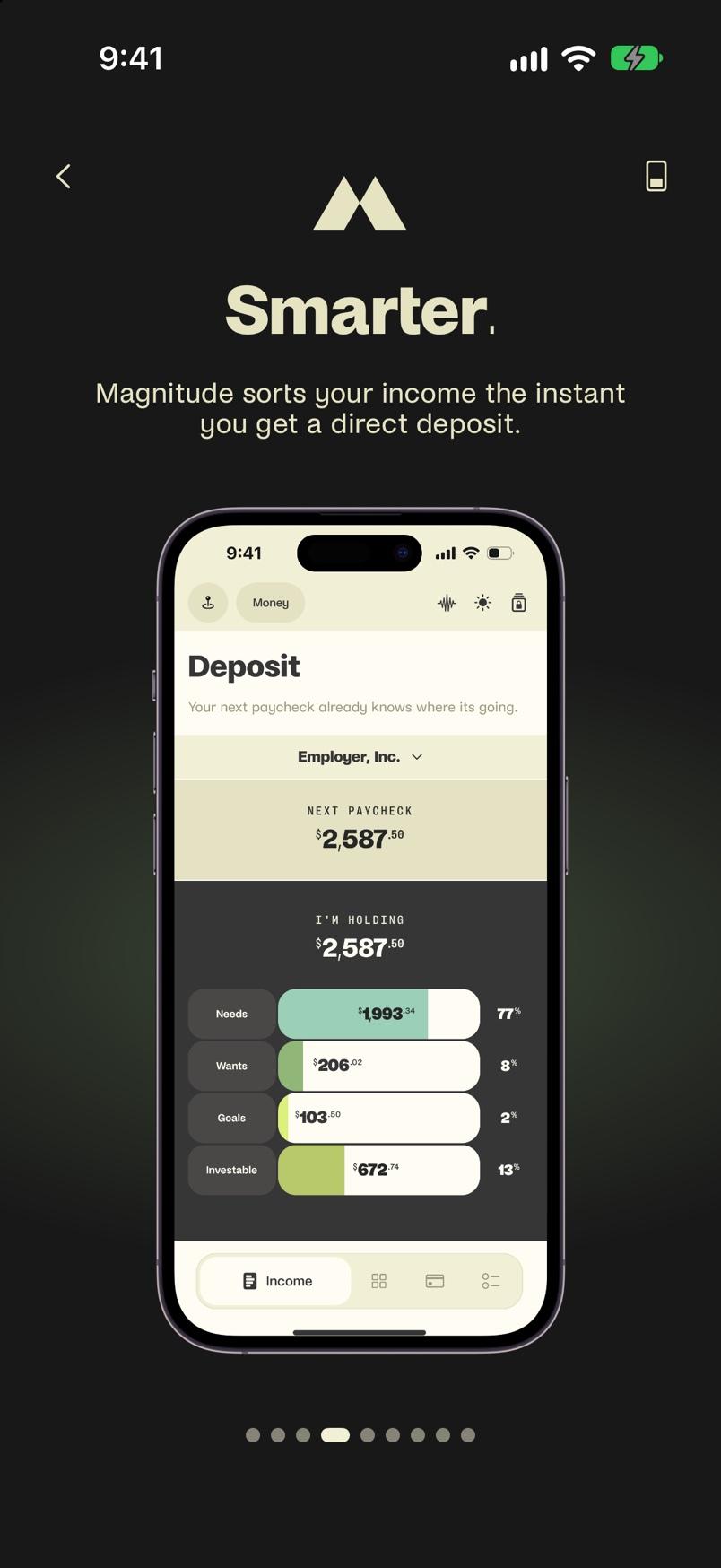
- Split each paycheck the moment it arrives into reserves, one for each thing it has to cover: rent, groceries, school.
- Trade-off
- It ships as three product lines. Lens plans the money and launches first, but can’t enforce the plan. Lift holds each paycheck to it, and Link is Lift for couples. Money movement is built and tested in sandboxes.
- Outcome
- Every dollar gets a job on payday, so you see what’s safe to spend before you swipe.
Budgeting apps like YNAB, Copilot and Monarch can’t enforce anything, and they look backward. Many institutions earn fees on customers’ money mistakes; the bet is a structure designed to prevent them automatically.
- Plan: What should it do?
- Deposit: How will pay split?
- Today: What can I spend?
- Pay: Which reserve pays?
- Activity: What happened?
Designed for a behavior, not a demographic
Eleven personas defined by how people handle money, not age or income: from the Juggler working two jobs to the Builder whose ambition is ahead of their income.
Calm, ahead, in control
Money stress is a feeling, so the design had to change the feeling, not just the math.
- Problem
- Financial apps make money feel like punishment: a bar turns red, a fee lands, and neither tells you what you can still do.
- Decision
- Write the plan as one first-person sentence, with amounts that update the moment you spend, by the day, until payday or by the month.
- Trade-off
- Copy becomes product logic: every number must earn its place in the sentence.
- Outcome
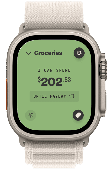
- No charts to decode. Today just says “You have $310.83 for groceries — 14 days until paid.”
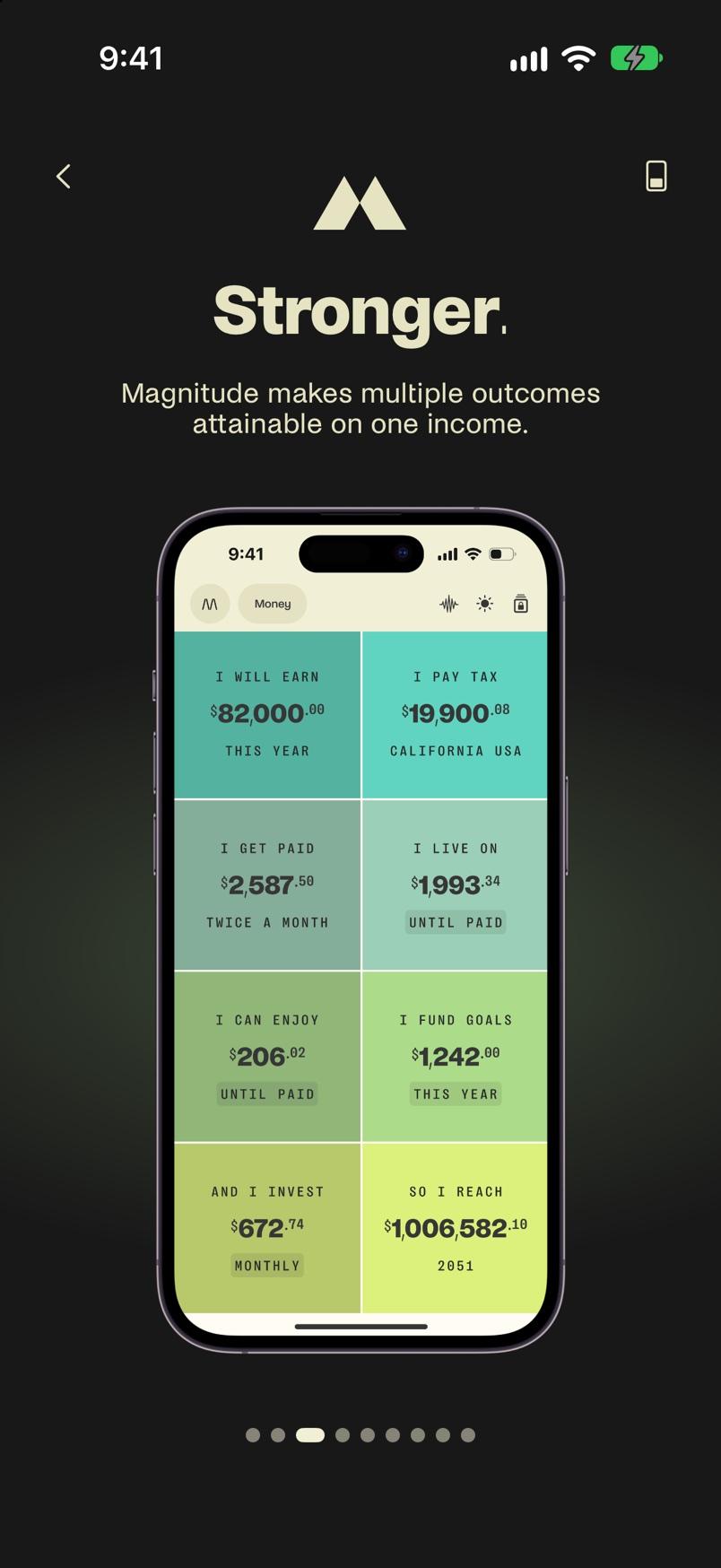
The plan reads as one sentence: I earn… I keep… I need… I enjoy… I save… if I invest… I could reach. My co-founder and I shaped the words together; I designed the interactions.
Built for the wrist
The watch switches reserves only on a confident merchant match, because a wrong guess costs more trust than no guess.
Magnitude does 99%; you do the 1%
When a charge keeps repeating, Magnitude drafts it as a recurring bill and asks you to confirm. There’s no “approve all,” because that would give away the one decision that’s yours.
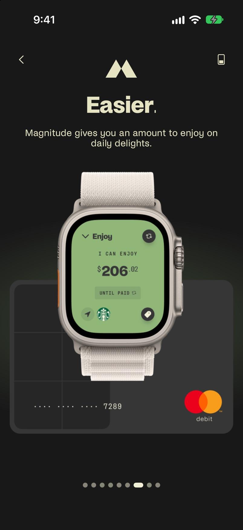
Some things are only known in the hand
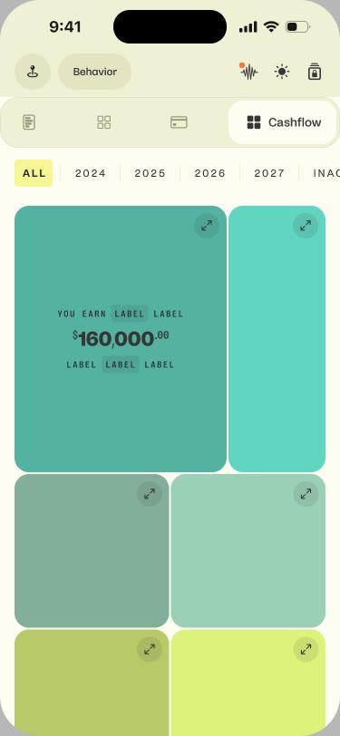
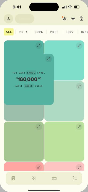
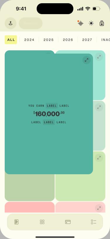
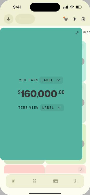
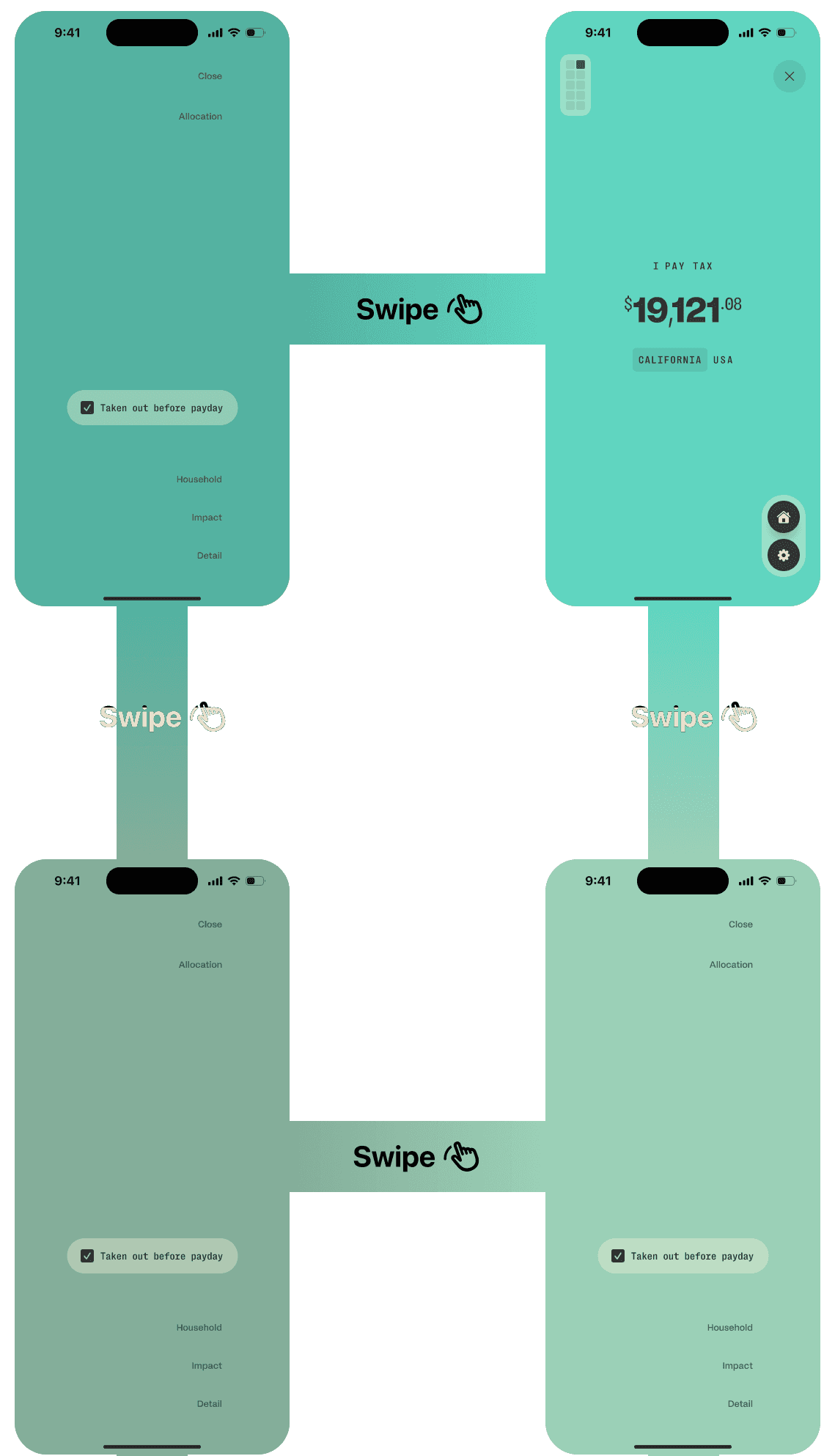
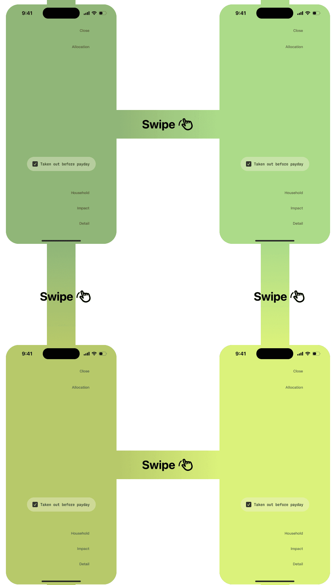
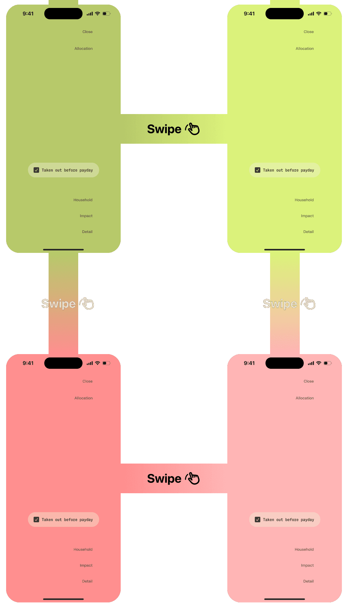
For a tile opening into its full screen I drew two options in Figma: Squish, where it pushes its neighbors aside, and Cover, where it rises over them. Both looked right as frames, so a developer built both. Once we could use them, Cover made perfect sense and Squish felt clumsy. Cover shipped.
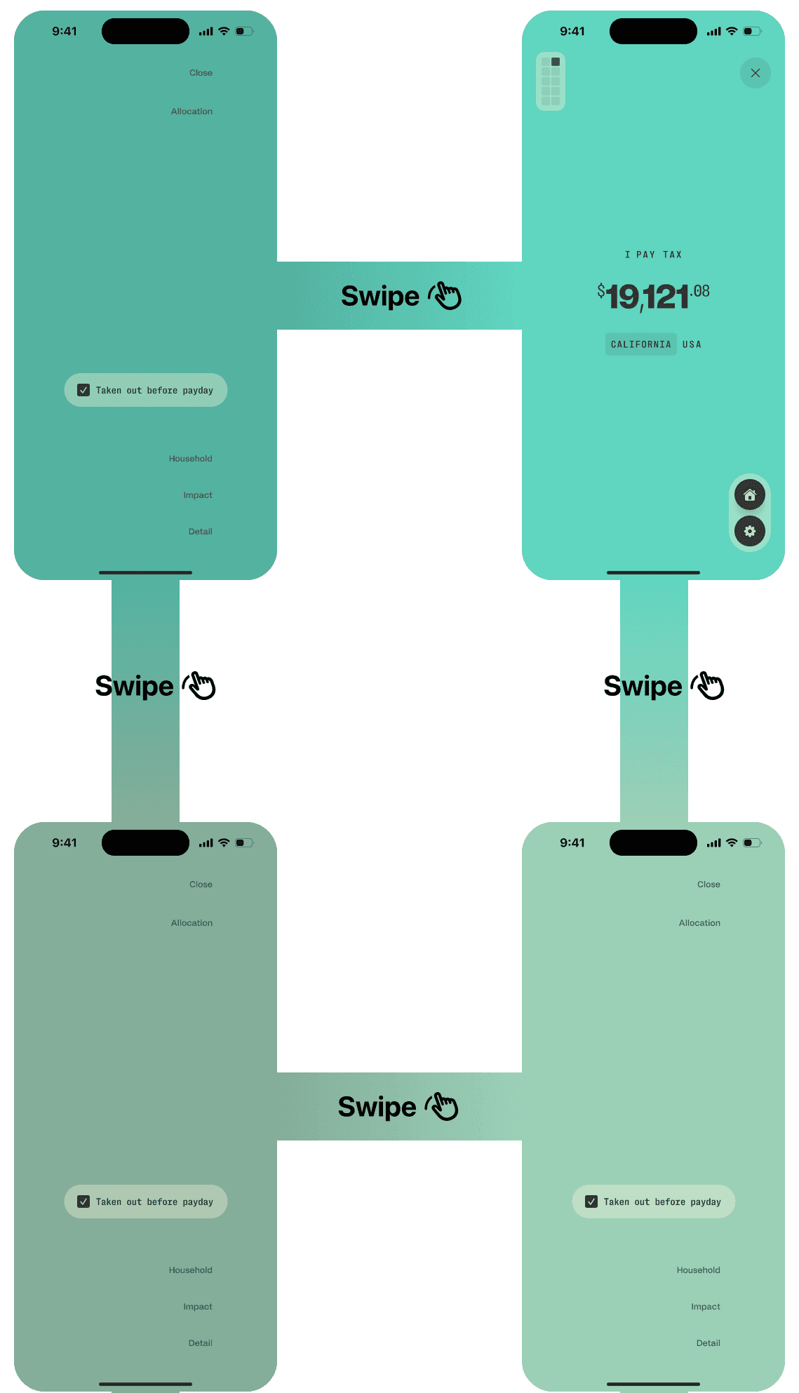
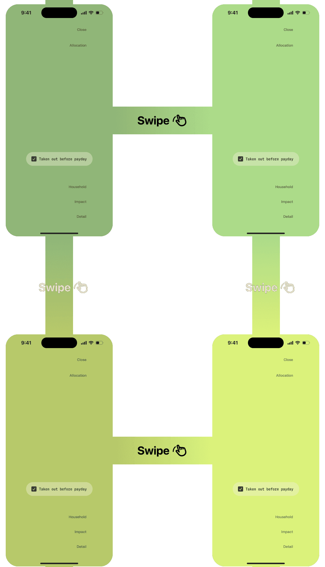
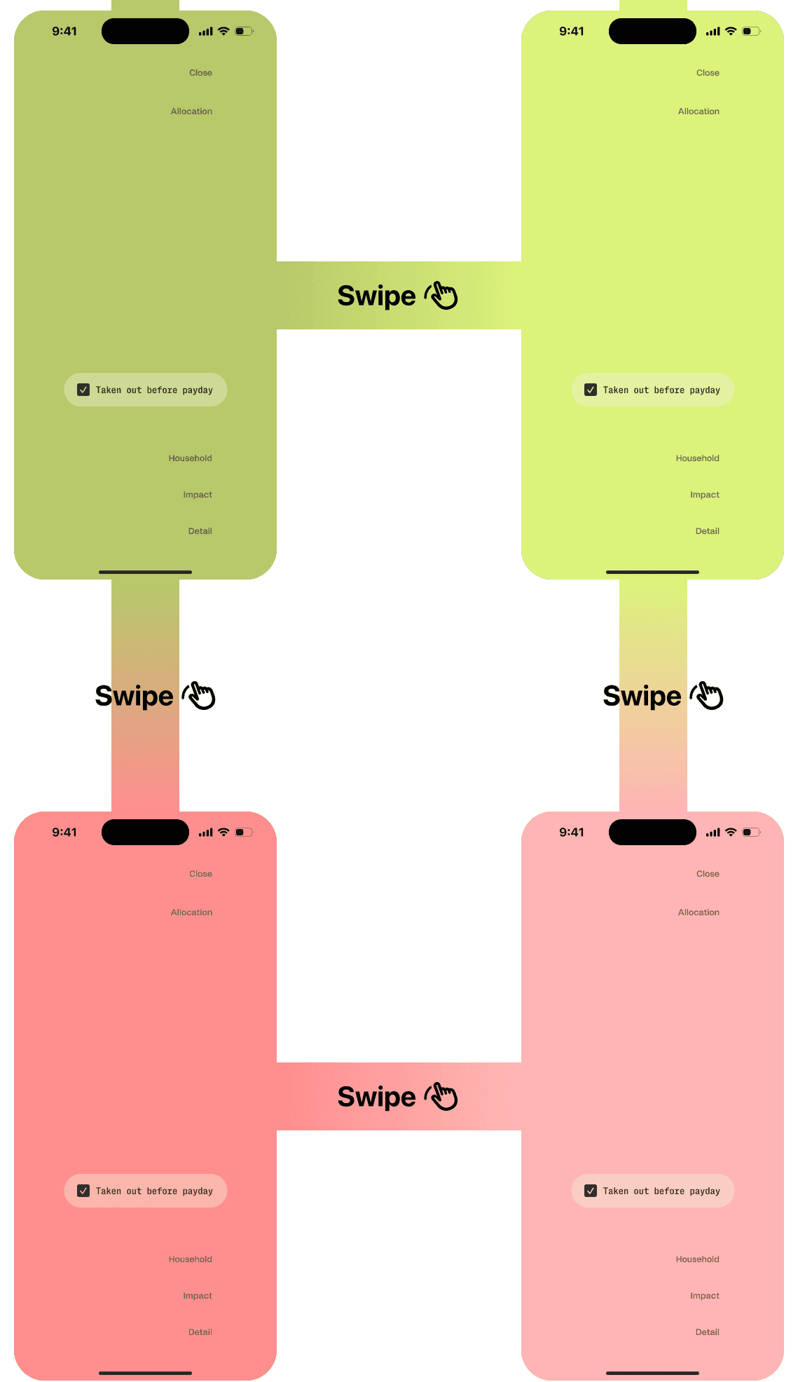
I designed the screen comparing your plan to your spending as a departures board: positions stay put, figures flip. Four of eight automated reviewers called it a critical bug, and the session “fixed” it into a rippling, flashing layout. I restored the prototype and found the real fault in ten-times slow motion. Our rule now: a critical finding is a claim about intent, and reviewers can’t see intent.
Then the board taught me what Cover had. In the hand, the flaps read as a travel app, not a finance app. The team agreed upon a pulse: quieter, and native to the rest of our motion.
A · Squish
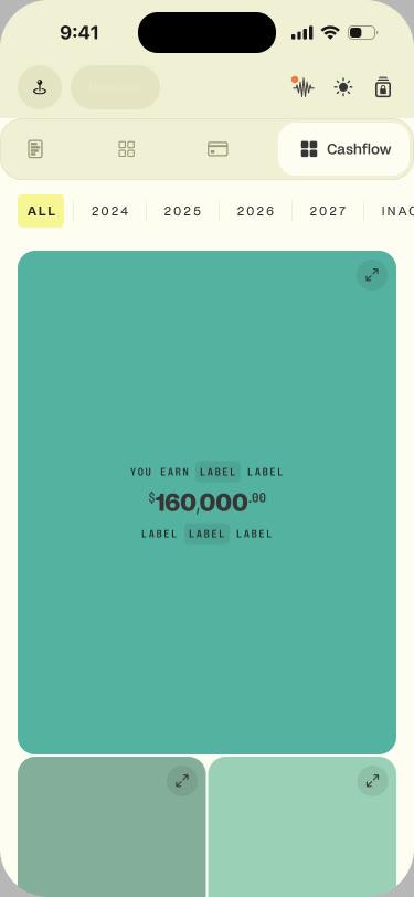
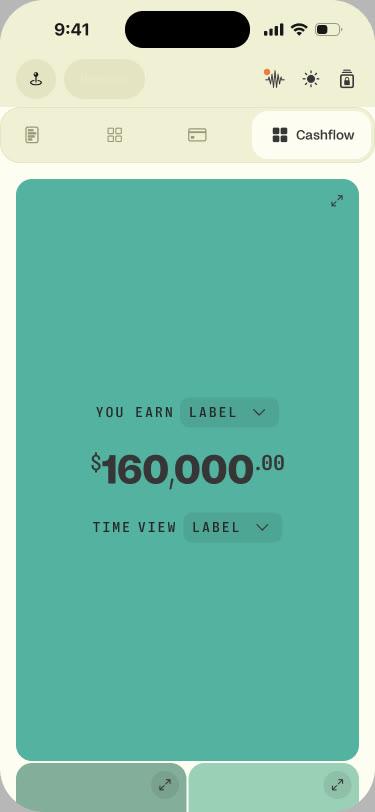
B · Cover · shipped
Leading without a title
We’re under ten people, each the expert in their own lane, so I lead through the work. My co-founder brings the vision, we shape the product roadmap together, and I polish the flows, UI and UX. With our content lead, I set the blog’s art direction: restraint. Photography in sepia, monochrome or black and white, and graphics as minimal vector line work, abstract enough to carry ideas that aren’t obvious.
One design language, two contracts, enforced by machines
A design system that lives only in a document decays. On the web, breaking ours blocks the release.
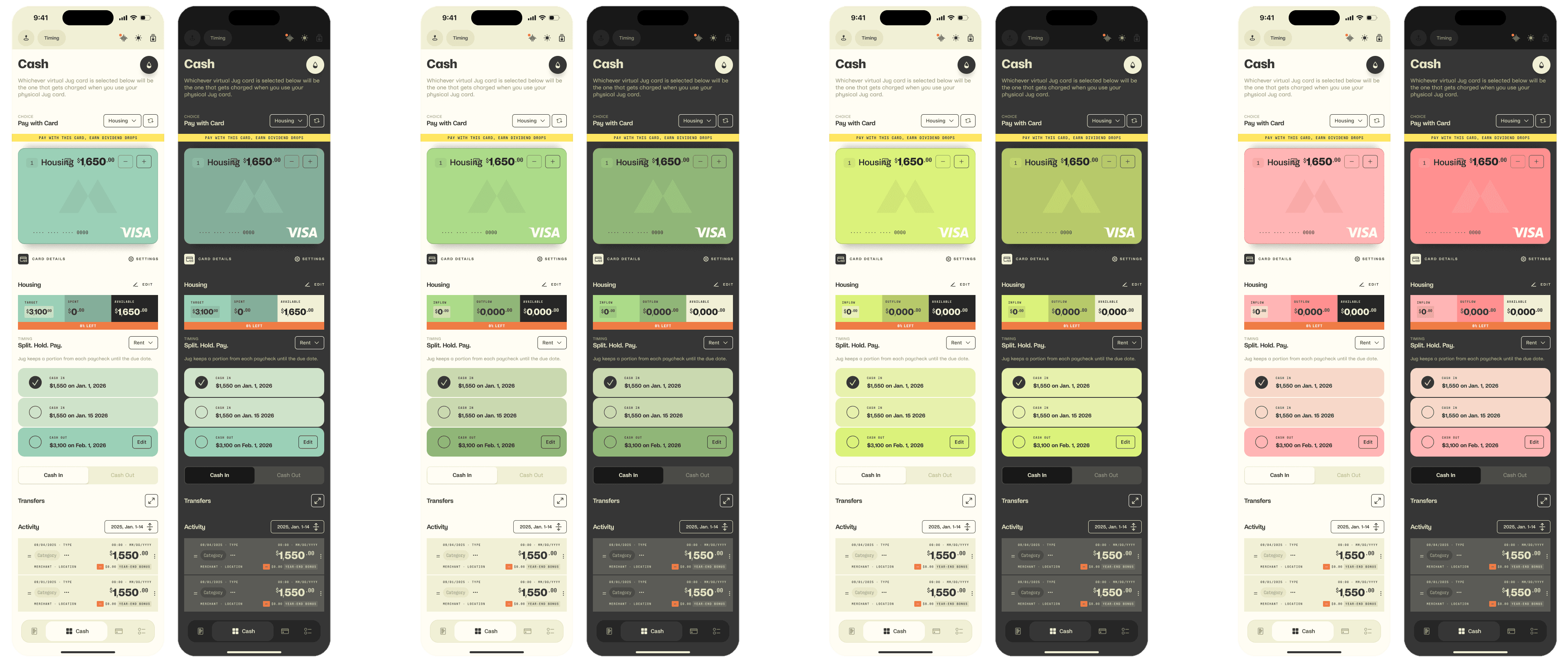
The CSS and the docs generate from one token file. Existing rule breaks are logged, and that list can only shrink; new ones block the release. Two AI reviewers catch what rules can’t, like a vague error message or a hand-built card. On iOS, my contract narrows 555 color sets to about 80 public tokens, enforced by a review agent.
The library, from scratch
I built the component library from scratch in Figma, with contributions from my co-founder. Our iOS developers built it in Swift.
- Web: one file is the single source of design values.
- It generates the CSS and the token section of DESIGN.md, so the document cannot fall behind the code.
- The marketing site and the Fleet Factory both use those tokens.
- The web app lives separately and keeps an exact copy of the design values, so a homepage change can never ship it.
- Rules that only tighten, a style check and an AI reviewer block or flag any drift on the web.
- iOS: design.md is the app’s own contract. It narrows 555 color sets to about 80 public tokens.
- An AI reviewer enforces it on every change that touches the design system.
Building the company’s operating system
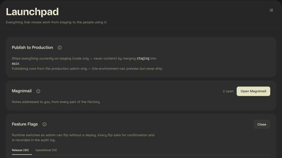
Content, marketing, an investor data room and deploys: one app, one database, one design system.
- Problem
- The company needed a content system, a marketing stack, a data room and a deploy pipeline. Outside tools would each keep their own copy of the audience.
- Decision
- Build them as one app, where people, investors and agents sign in to the same house.
- Trade-off
- We build and maintain it instead of renting. In return, everything integrates natively.
- Outcome
- The place the company runs from: 164 pages, 362 admin API routes and one record of every audience.
- Blog: a post brings them in
- Form: signup stamps the post
- User type: 10 answers, 11 personas
- Lifecycle: 14 statuses, one source
- Email: consent gate on every send
Agents point; people press
People and agents share one directory, one inbox and one feed. The assistant can point and highlight, never click, submit or write.
The website: the fourth product
Every word on the site is edited in the Fleet Factory. The homepage background turns from day to night when the sun sets where you are.
Designing the machine that builds the product
Nine phases, each passed before the next begins, and a memory the next task reads first.
- Problem
- Shortcuts hide defects: a run that skipped half the pipeline left three; a hand-picked review team missed seven more.
- Decision
- Nine required phases, and a wiki every task writes to and the next reads first.
- Trade-off
- Even a simple-looking change goes through all nine phases, which costs time and AI usage.
- Outcome
- Defects get caught before they ship, and each lesson is learned once.
I assembled it from Every’s Compound Engineering plugin, forked, adding a requirements phase and custom reviewers. I’m a contributor to the open source project.
- Phase 1: Ideate
- Phase 2: Brainstorm
- Phase 3: Requirements
- Phase 4: Plan
- Phase 5: Work
- Phase 6: Security
- Phase 7: Simplify
- Phase 8: Review
- Phase 9: Compound
- Compound writes a wiki entry that the next ideate and plan phases read before starting.
- 56 quality checks run inside every deploy, so nothing reaches production without passing them.
- People: Set direction
- People: Approve the plan
- People: Run production SQL
- People: Press Publish
- Agents: Implement with tests
- Agents: 8–19 specialist AI reviewers
- Agents: Write the audit files
- Agents: Keep the memory
- Between them sit the checks: each phase must pass, 56 quality checks run inside every deploy, and a full AI review must finish.
What’s still open
Open problems
Traction is still ahead of us, so these numbers measure the work, not the market. And the pipeline is fallible: one change passed every check and still shipped two defects where two separately tested parts meet.
What I’d do differently
I’d build the gates and the memory a year earlier; the curve bends after they arrived.
Credits
My co-founder and CEO: the agent fleet. Together we shaped the words and the product direction. Our two iOS developers built the app in Swift. Our content lead: content. Mine: the design contracts, the iPhone screens in Figma, the Figma library (with my co-founder), the plan’s interactions (a developer built them), the blog’s art direction, the web workflow, and about half of the web platform’s merged pull requests.
Every picture from the case study
The whole case study, as one Markdown file.
For ChatGPT, Claude or your own agent: every word, fact and caption, with each of the 16 images as a link and its alt text. 2,948 words, nothing left out.
https://www.joshuamartens.com/work/magnitude.md

Connect
I do my best work when I own a product area and keep improving it. Let's build.