
A game made for the wrist
An arcade chase for Apple Watch: a cracker-sized screen, one-minute runs, and the Digital Crown as the wheel. I made all of it: idea, art, code, sound, business model and launch.
TLDR
- The product. An arcade chase game for Apple Watch, steered with the Digital Crown, and also on iPhone and iPad.
- My role. All of it, solo: concept, game design, art, sound, business model and launch. Claude Code wrote the code and I directed it.
- The result. 10 days from first sketch to Apple Watch, iPhone and iPad, and now on the App Store.
- What’s below. Eight decisions, from the first idea to the iPhone. The whole case study takes about 8 minutes to read.
Eight decisions
Everyone is somebody’s lunch
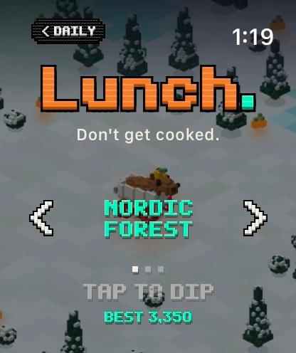
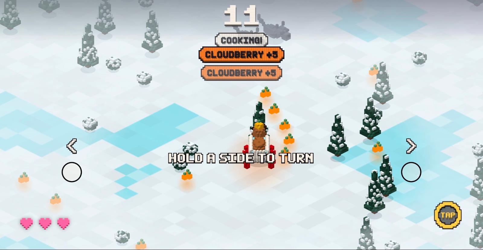
Cappy is a capybara in a bathtub on wheels, and the food chain has woken up hungry. Turn the Digital Crown to steer him through forests, badlands, mountains, a river and a sky ocean, and survive as long as you can.
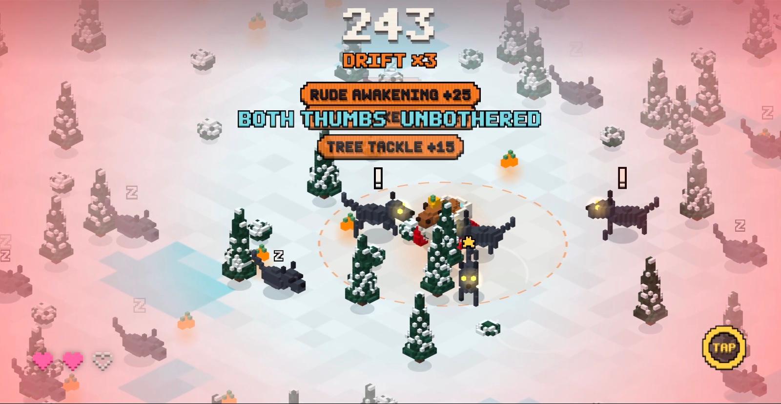
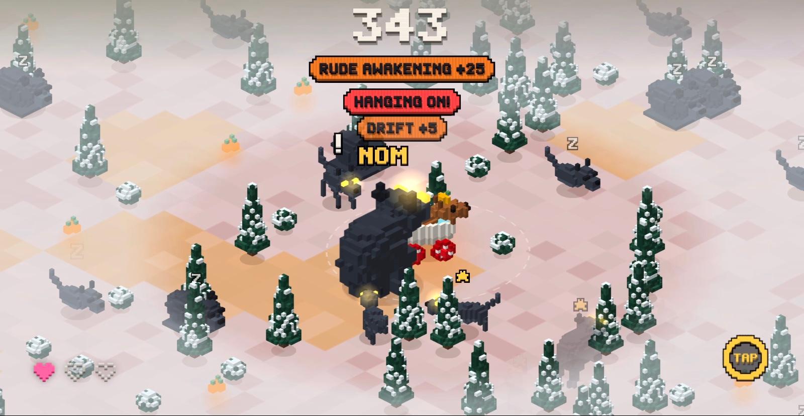
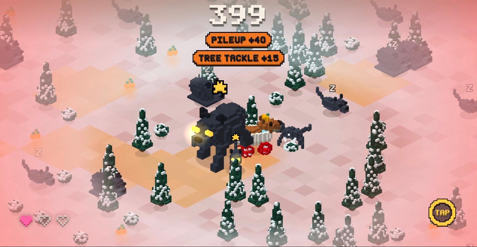
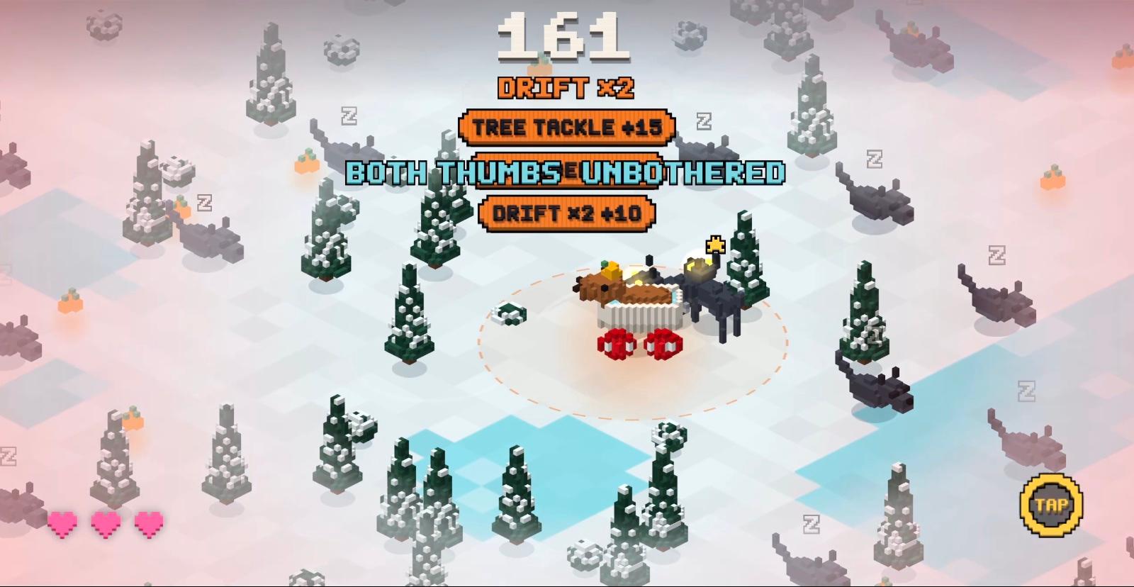
Predators sleep until you pass too close, drift nearby or clip their tree. Every wake-up pays a bonus, so poking the bear is a strategy. Lead them into trees or each other. Tap to go Unbothered and they lose your scent. Three bites and you’re lunch.
I wanted a project where every decision was mine, from the pitch to the price.
Everything it took
- Concept
- Game design
- Art direction
- Product design
- Game UX
- watchOS & iOS development
- Sound design
- Haptics
- Branding
- App icon
- Sticker pack
- Widgets & complications
- Business model
- Marketing & App Store
- Release
There was no good chase game for the wrist
- Problem
- Voxel car chases are a hit on phones (a voxel is a volume pixel: think blocky 3D), but none existed for Apple Watch, where a whole game must fit one wrist-raise.
- Decision
- Design for the watch first, from a game bible written before any code.
- Trade-off
- The iPhone game waited, and every feature had to serve one of five pillars or go.
- Outcome
- Scope stayed tight.
The bible set the pitch, controls, scoring and difficulty: a first-timer survives about 15 seconds, a median run lasts 45. Up, down and jump were cut.
Joy in the first second
No menus, no tutorial. Raise your wrist, turn the Crown, run.
Built for the wrist
The Crown, haptics and short runs are the core, not a phone port.
Crashes feel good
Drifts, near misses and pileups are fun, even when you lose.
Weird and beautiful
A capybara in a bathtub, strange worlds, light worth a screenshot.
Fair, then fierce
Easy to start, deep enough to chase a high score.
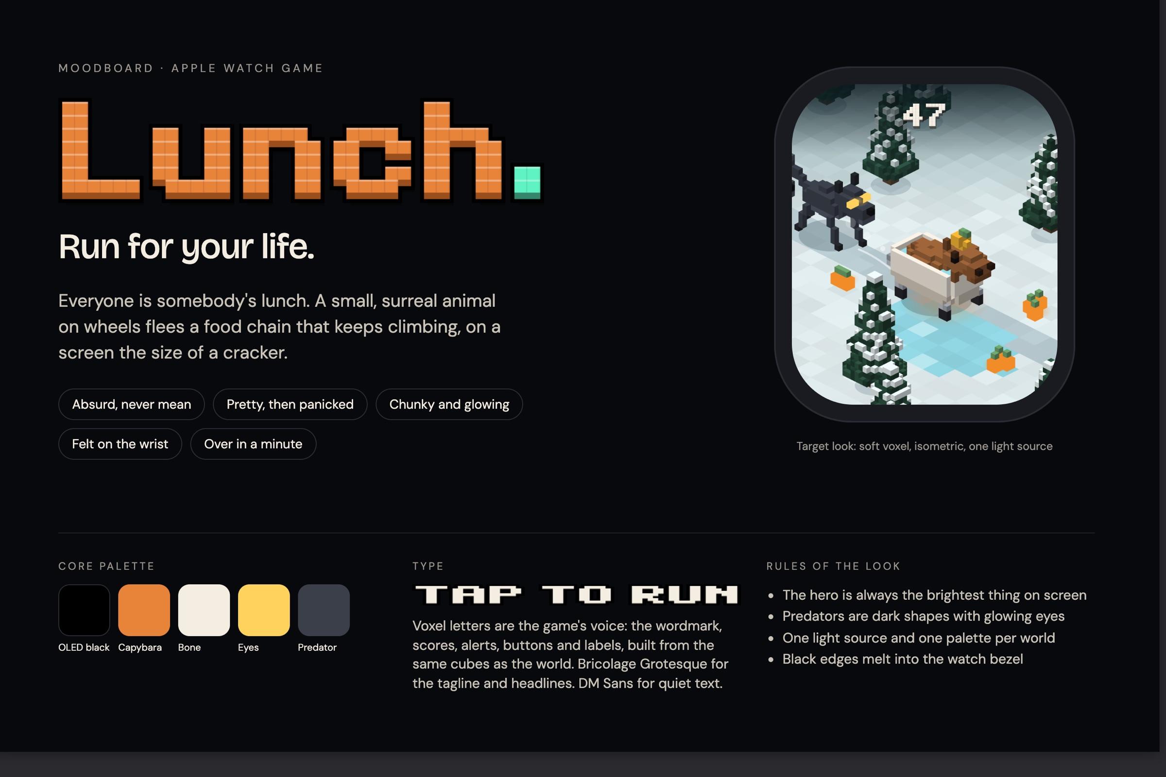
The look, before the game
A moodboard set the rules: soft voxels, isometric, one light and one palette per world. Cappy is always the brightest thing on screen; predators are dark shapes with glowing eyes, readable at a glance.
The Digital Crown is the steering wheel
- Problem
- A chase on a 46 mm screen is read at a glance, and every touch covers the thing chasing you.
- Decision
- Steer with the Digital Crown. A tap is the only other input.
- Trade-off
- Analog steering is unforgiving, and only a real wrist could tune it.
- Outcome
- The screen stays clear, and how hard you turn decides how fast the chase grows.
Gentle turns grip. A hard spin drifts, and drifting is loud: it wakes sleepers from twice as far.
The small screen as a design brief
Every screen fits a 208 × 248 point box.
One wrist-raise, one run
Runs last about a minute. Lower your wrist and the world freezes.
Prove the fun before building it
- Problem
- Whether a 60-second run is fun with one dial and one tap hung on untuned numbers: speed, grip, chaser speed, sleeper density.
- Decision
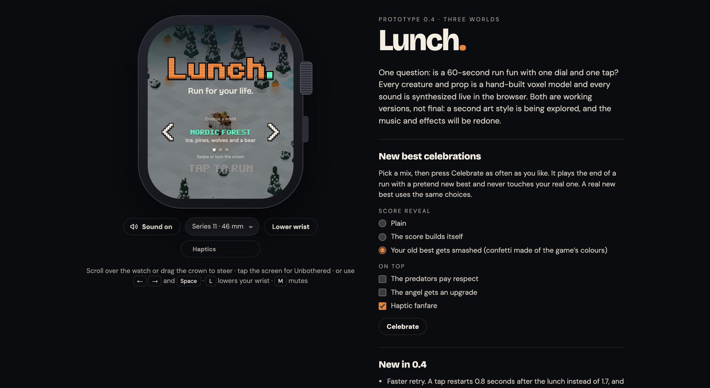
- Prove the rules in a browser prototype with live sliders, then tune the feel on the watch itself.
- Trade-off
- The rules live in two codebases, and they drifted constantly.
- Outcome
- Problems surfaced before the app existed.
The prototype proved the rules, but it’s played on a keyboard, and nothing about a keyboard feels like a Crown. So the watch got its own tuning controls. I tuned on the wrist, then carried the settings back to the prototype. The watch won.
Building with Claude Code
Claude Code wrote the code. When it made a choice I didn’t like, I treated it like a teammate: it explained why, then gave me three to five other ways to do it. I picked one, or reshaped it.
The first run, beat by beat
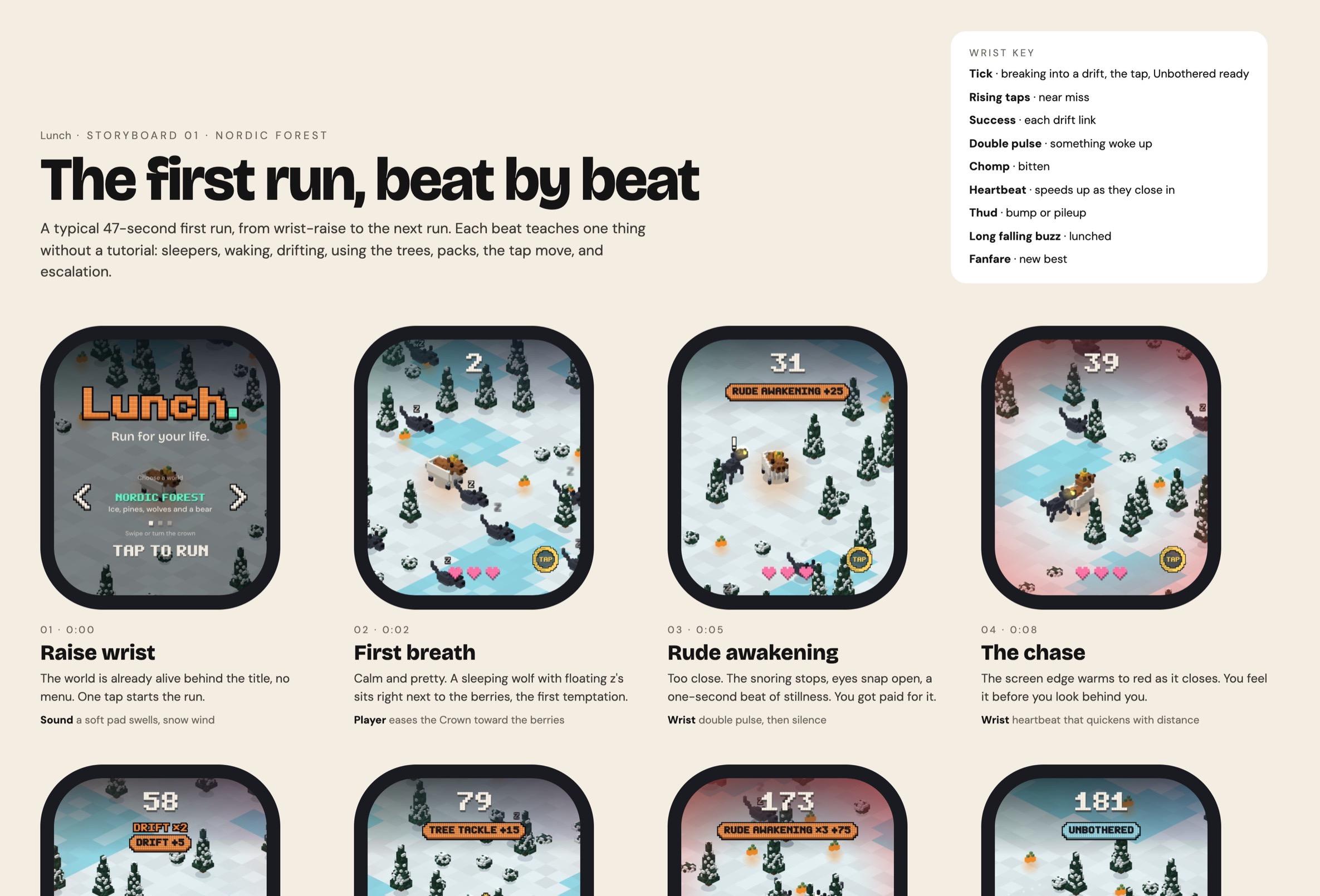
A storyboard mapped a 47-second first run: what’s on screen, what you do, what the wrist feels. Each beat teaches one thing, so there’s no tutorial screen.
A 3D look on a watch that can’t do 3D
A script pre-renders every model into 2D images, drawn from 24 angles: 2,306 crisp images, light on the battery. The cost: characters turn in 15° steps, and a model change means a re-render.
Designed for a glance
Watch games are played in glances, often with the sound off. A lighter set of haptics is the default because the full set drained the battery. It’s fully playable on mute.
A haptic for everything you react to
A wake-up, a bite, a near miss and a drift each feel different.
You can see your noise
A dashed ring shows how far you’re heard, and sleepers twitch before they wake, so a sharp player reads the road.
A first run that teaches without words
Berries curve you around a tree, a Crown icon rocks until you steer, and a fingertip taps the Unbothered ring when predators close in.
One new world a day, the same for everyone
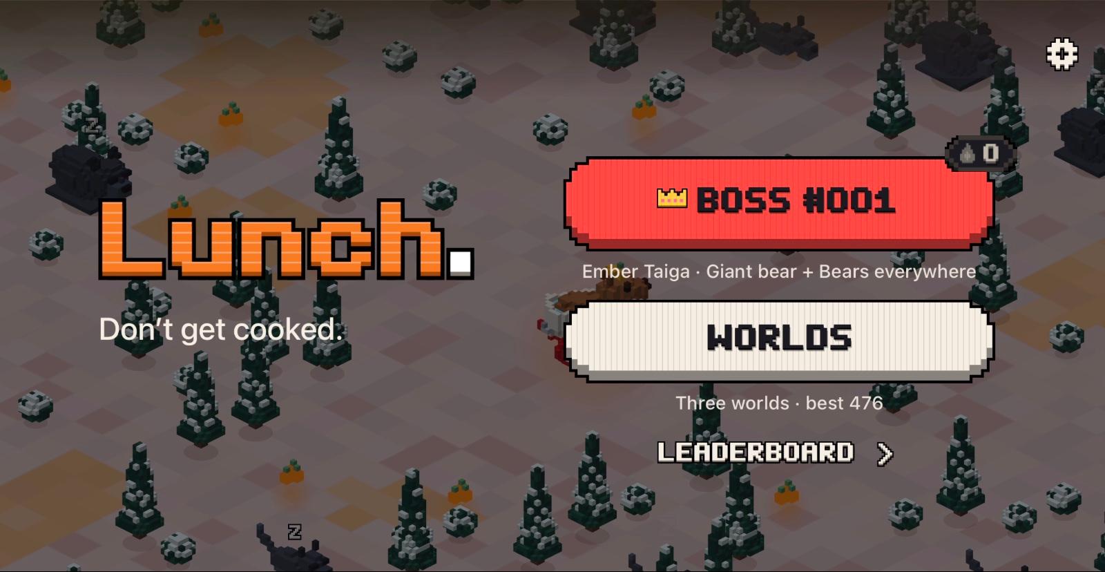
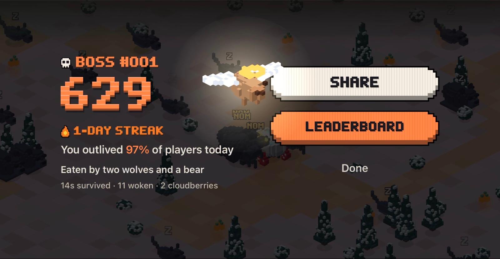
A game played in glances needs a reason to come back. Everyone gets one ranked run on the day’s world, and Sundays bring a boss. Practice all you like afterward, and keep the streak alive.
Pay once, play everywhere
- Problem
- One app across Apple Watch, iPhone and iPad, under Apple’s rules.
- Decision
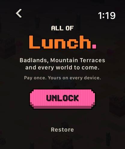
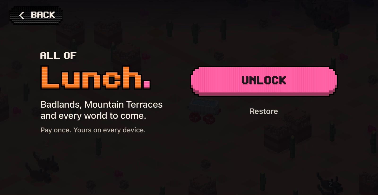
- One app and one $4.99 unlock, All of Lunch. The Daily is free; every world is locked but visible. No ads, subscription or account.
- Trade-off
- Anonymous play stats only, with a switch to turn them off: which worlds get played, never who plays them.
- Outcome
- One purchase covers every device, and the privacy label reads “Data Not Linked to You.”
In the beta (my daughter and me), the watch tracked first-run length and next-day return against thresholds set before the first build.
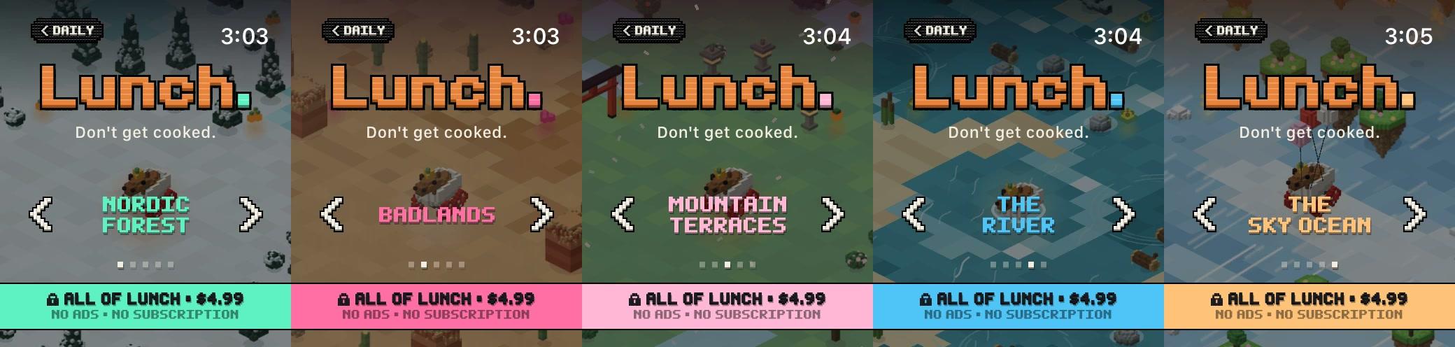
Locked, not grayed out
Nobody noticed the small gray padlock. Graying worlds out would hide the pitch, their colors and music, and a big padlock said locked, not what you get. So each locked world keeps its colors and gets a band in its own accent, saying what the unlock gives: no ads, no subscription.
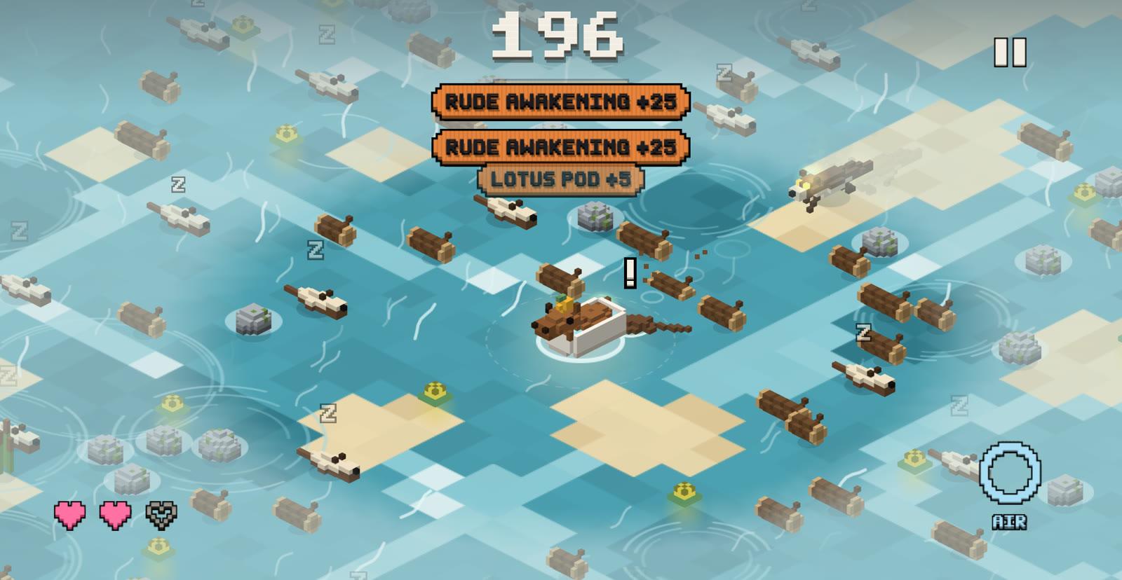
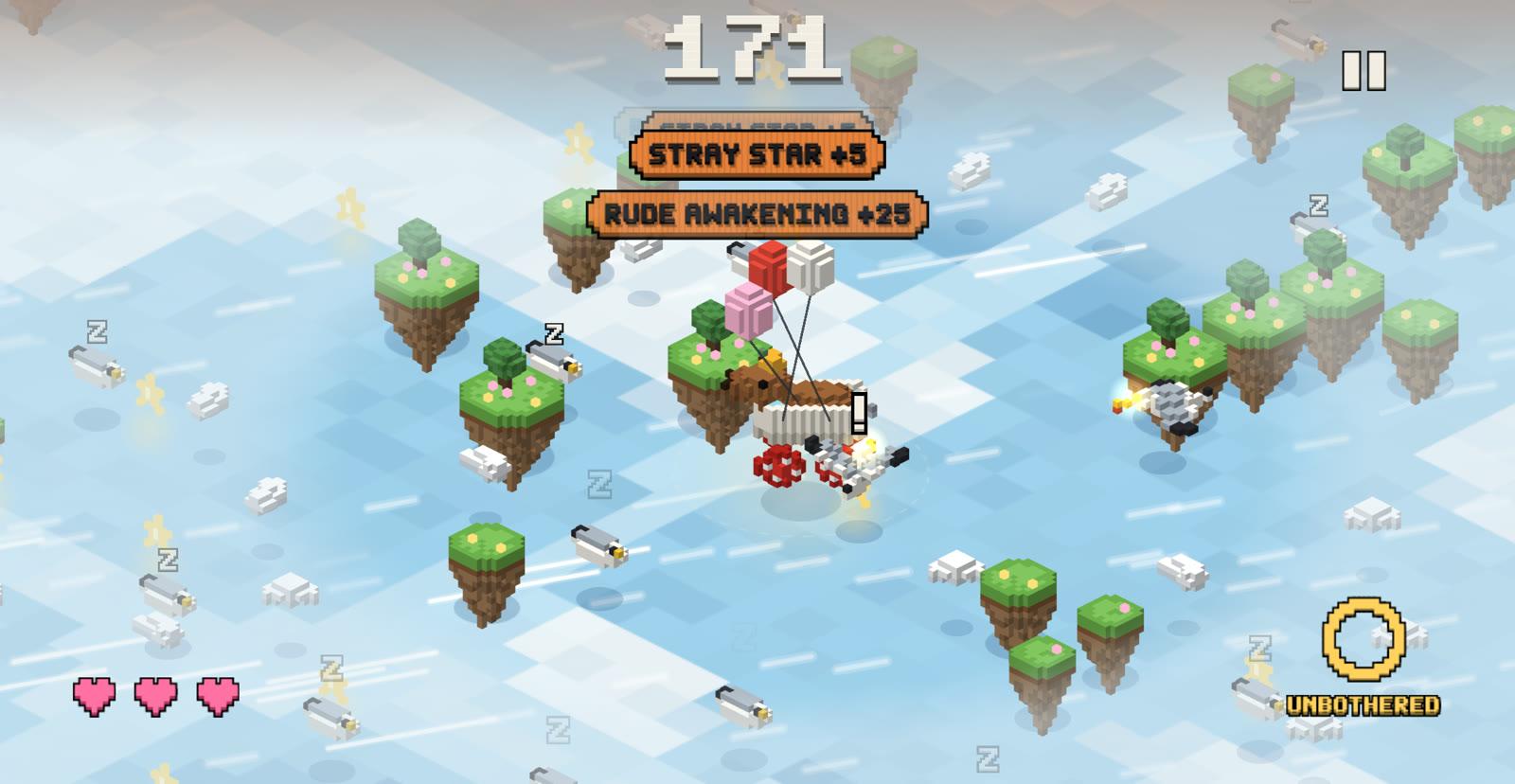
Two new worlds
The River floats the tub on a current; tap to dive. The Sky Ocean hangs it from balloons over floating islands.
Then the iPhone, as a natural extension
A bigger screen at the same scale would make the Daily easier, so every device sees the same radius around Cappy, with weather beyond it. It’s a game in its own right, not a port. Hold the phone in landscape and steer with your thumbs; both at once go Unbothered.
Widgets, complications and Control Center
Today’s Daily lives on the Home Screen and the watch face, and a Control Center button drops you straight into it.
An iMessage sticker pack
Twenty-four animated stickers, rendered from the game’s own models.




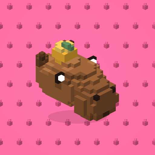
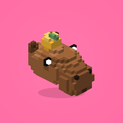
The app icon
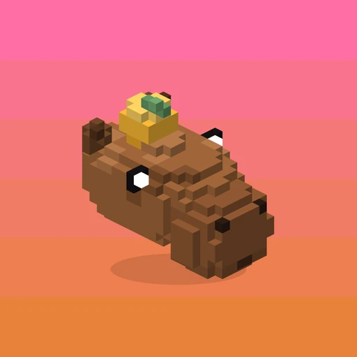
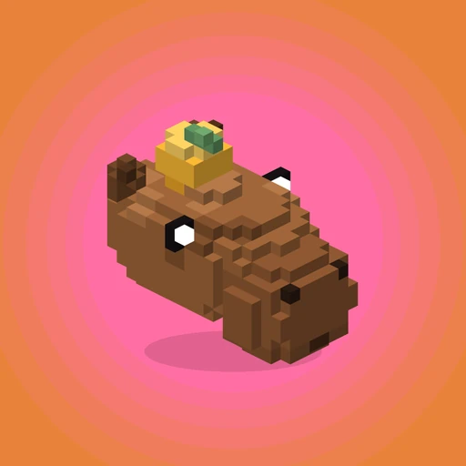
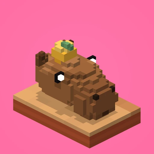
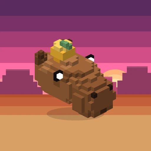
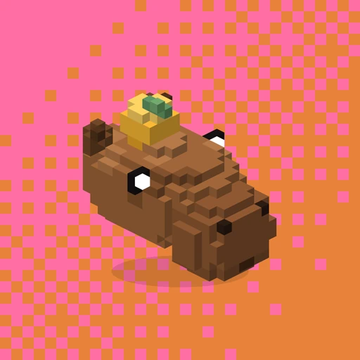
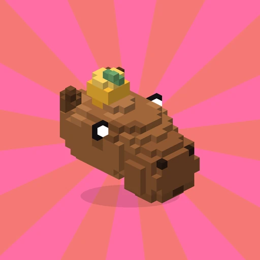
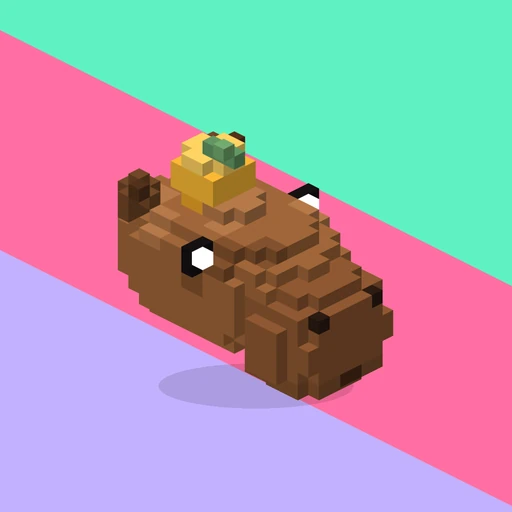
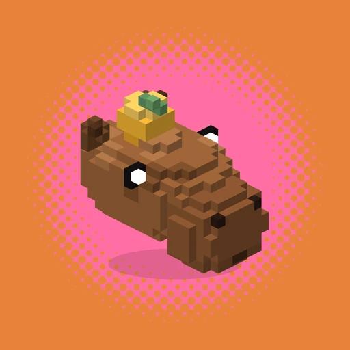
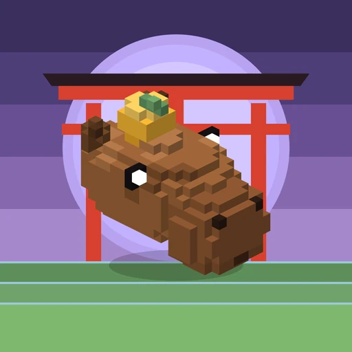
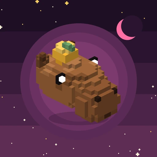
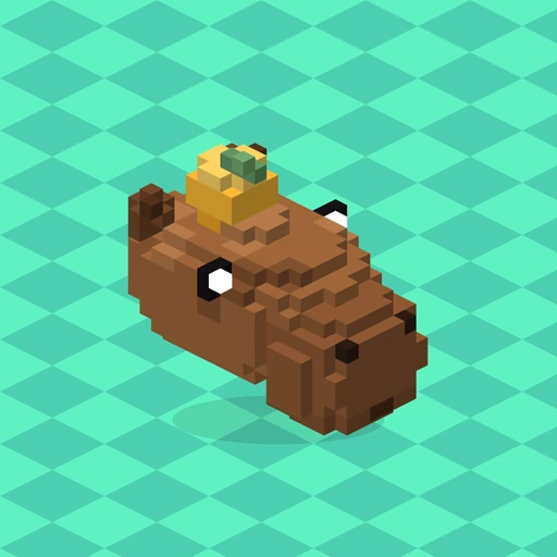
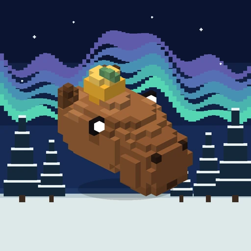
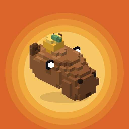
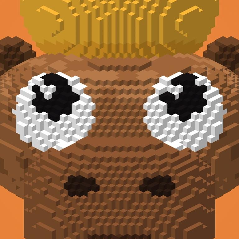
It has to read on a watch face and a home screen. After more than thirty backgrounds, the answer was Cappy’s own head over pink cubes.
Don’t get cooked.
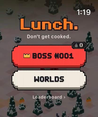
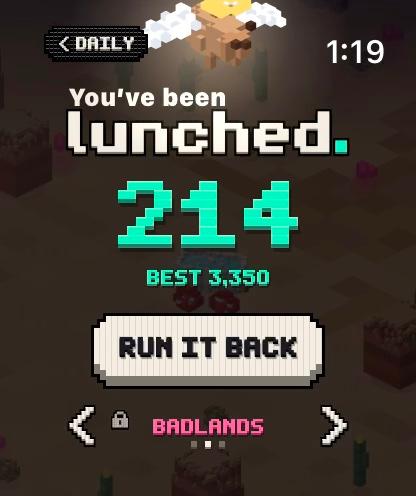
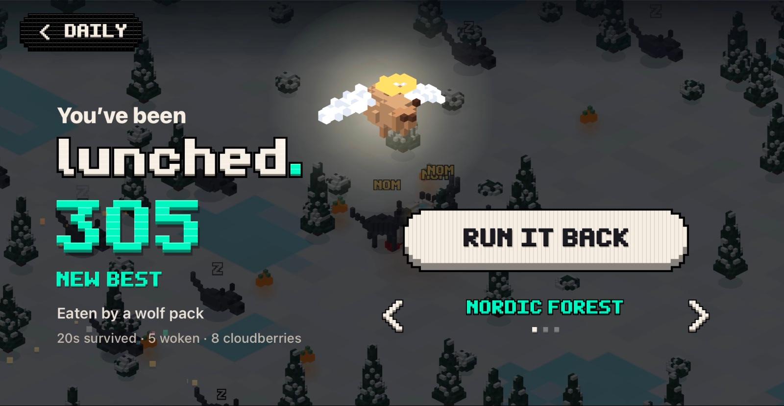
The copy is funny by contrast, never on the nose. Cappy drives a bathtub, so the game speaks bath and kitchen: “Don’t get cooked.”, TAP TO DIP, RUN IT BACK, and “You’ve been lunched.” as his angel floats up.
The same voice runs through the stickers, the App Store and the landing page.
“A new world every day, the same for everyone. One ranked run, a streak to keep, and a capybara in a bathtub who would like to keep his.”
— The App Store promotional text
From an idea to the App Store, on my own
days from first sketch to Apple Watch, iPhone and iPad
voxel images, all rendered by script
unit tests guarding the rules and the Daily
accounts, names or emails collected
After launch
Parental controls made the first install rough for kids: my daughter hit iOS’s raw purchase error. Version 1.1 checks first and offers an Ask a parent button on iPhone and iPad. A paid world marked “free today” played the Daily instead, so every world now sits behind the one unlock.
What I’d change
Test the first open after an update on real phones: a gray screen survived two releases until 1.2 fixed it. Build the Daily to change without an app update.
Every picture from the case study
The whole case study, as one Markdown file.
For ChatGPT, Claude or your own agent: every word, fact and caption, with each of the 47 images as a link and its alt text. 3,248 words, nothing left out.
https://www.joshuamartens.com/work/lunch.md

Connect
I do my best work when I own a product area and keep improving it. Let's build.